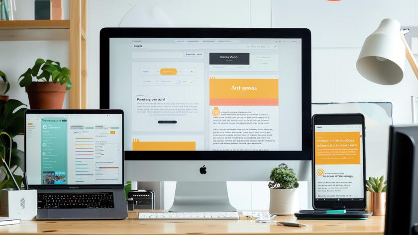
In today’s digital age, having a responsive web design is no longer a luxury – it’s a necessity. As the majority of internet users access websites through various devices, including smartphones, tablets, and desktop computers, ensuring that your site adapts seamlessly to different screen sizes is crucial. In this blog, we’ll explore the significance of responsive web design and its impact on user experience. Additionally, we’ll delve into how responsive design plays a vital role in various web development approaches, including WordPress development, Shopify development, and custom development.
Responsive web design isn’t just about fitting content onto different screens; it’s about crafting an experience that adapts seamlessly to the user’s needs. By prioritizing responsiveness, we ensure every interaction feels intuitive, every visit feels effortless, and every user feels valued.
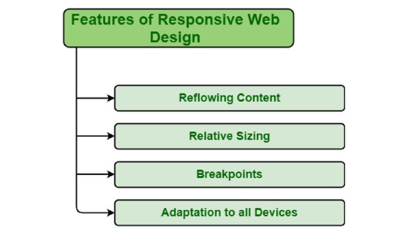
The Significance of Responsive Web Design.
Responsive web design involves creating websites that automatically adjust their layout and content to fit the screen they’re being viewed on. It ensures an optimal user experience across all devices, regardless of their screen size or orientation. Here’s why responsive web design matters:
- Enhanced User Experience: Responsive design ensures that users can access and navigate your website effortlessly, regardless of the device they’re using. It results in higher user satisfaction and longer visit durations.
- Improved SEO: Search engines, like Google, favor responsive websites in their rankings. Having a responsive design can positively impact your site’s SEO, leading to increased visibility and traffic.
- Reduced Bounce Rates: Non-responsive websites often drive away visitors due to a poor mobile experience. A responsive design reduces bounce rates by providing a consistent and user-friendly interface.
- Cost Efficiency: Developing a single responsive website is more cost-effective than creating separate versions for mobile and desktop. It’s easier to maintain and update, saving you time and money.
Responsive Design in WordPress Development.
WordPress is a popular content management system (CMS) known for its flexibility and ease of use. When developing a WordPress website, implementing responsive design is crucial. This means using responsive themes and ensuring that all plugins are mobile-friendly. You can also optimize image sizes to improve load times, benefiting both user experience and SEO.
Responsive Design in Shopify Development
Shopify is a leading e-commerce platform used by businesses to set up online stores. With mobile commerce on the rise, responsive design is a fundamental aspect of Shopify’s development. Themes on Shopify are designed to be mobile-responsive, making it easier to create e-commerce sites that look and perform well on any device. Customization of these themes should focus on ensuring a seamless shopping experience for mobile users.
Custom Development with Responsive Design
Custom web development allows you to build a website tailored to your unique needs. When incorporating responsive design into custom development, you have full control over every aspect of your site’s layout and functionality. Custom development ensures that your site performs optimally across all devices and provides a unique user experience.
Conclusion
Responsive web design is not an option; it’s a requirement in today’s digital landscape. It has a profound impact on user experience, SEO, and overall business success. Whether you’re using WordPress, Shopify, or custom development, ensuring a responsive design is at the core of your web development strategy is essential. It’s a step toward providing a consistent and user-friendly experience for your website visitors, regardless of how they access your site.